

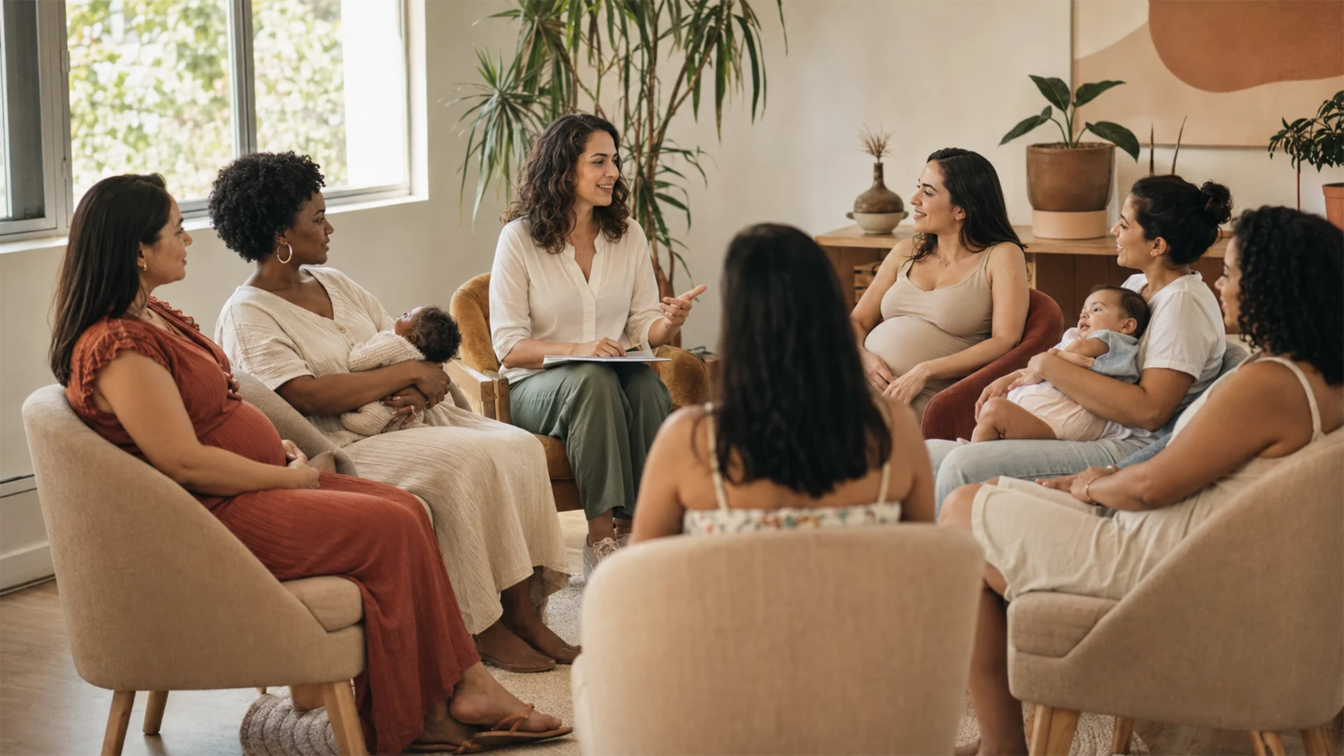
Imagem principal do case Gamp21

A digital experience to support families and bring companies closer

Gamp21

Content organization and interface design for a support network focused on motherhood and fatherhood.

Role

Information Architecture

UX/UI Design

Visual direction

Delivery

Institutional website

“For mothers and fathers” blog

01

Context

Understanding the project context and the people involved.

This section presents the product, the audience and the business environment that shaped the work.

The goal was to organize information, services and decision points into a clearer digital experience.

My role

  • Information architecture
  • Content organization
  • Visual direction
  • UX/UI Design
  • Responsive interfaces
  • Structuring the journey between content and services

Project characteristics

  • Content for mothers and fathers
  • Courses and guidance
  • Services for companies
  • “For mothers and fathers” blog
  • Simple and welcoming experience
Desktop homepage presenting Gamp21’s value proposition and main paths.
The same experience adapted for mobile navigation.
02

Challenge

Turning complexity into a simpler, more useful journey.

The main challenge was to reduce friction without hiding important information or weakening the business goals.

Each decision balanced clarity, content hierarchy, conversion paths and the real needs of people using the product.

03

Role

From strategy and information architecture to interface design.

My work connected UX strategy, journey organization, information architecture, UI design and high-fidelity prototyping.

The process also included alignment with stakeholders and preparation for implementation and future product evolution.

Scope of work

  • Information architecture
  • Content organization
  • Visual direction
  • UX/UI Design
  • Responsive interfaces
  • Structuring the journey between content and services
Home e caminhos principais
Services
Content
04

Services

Connecting services, information and contact in one experience.

Service pages were organized to clarify options, reduce doubts and create more direct paths to action.

The structure supports both discovery and recurring needs after the first contact.

Services organized for families, companies and different moments of parenthood.
05

Content

Using content as part of the product experience.

Content was treated as a path for discovery, education and trust before direct contact or conversion.

The structure helps users understand the offer and continue the journey with more confidence.

The “For mothers and fathers” area organizes accessible content for families.
Content also appears on the homepage as an entry point to new readings.
06

Impact

Impact of the solution

The solution improved clarity, organization and continuity across key moments of the digital journey.

Google impressions

+103 mil

impressions recorded in Google search results over the last six months.

Organic visits

847

visits from organic search in the same period.

Mobile clicks

70%

of clicks came from people accessing on mobile.

Educational materials

+47 mil

impressions for educational PDF materials over the last six months.

07

Learning

What the project reinforced about product experience.

The work reinforced that design decisions affect journeys, content, operations and future evolution.

A strong experience is built by connecting individual screens to the wider product system.

08

Conclusion

A clearer foundation for a product that can keep evolving.

The project organized information, flows and interface patterns into a more coherent experience.

Beyond the visual layer, it created structure for ongoing improvements and new business needs.

Great products are not born from screens.

They are born from understanding the right problems. Let’s talk about your product, process or digital experience?

Fabio Lopes
Download CV

Falopes Tecnologia Ltda. CNPJ: 44.968.718/0001-41

Fabio Lopes UX & Product Designer © 2026. Todos os direitos reservados.